From Ambiguity to Adoption: Rebuilding Kuda’s Design Tokens
It’s been two years since my last article. Life happened, tonsssss of work happened, and somewhere in between, I forgot that I actually enjoy sharing about my experiences as designer.
But I’ve been working on something at Kuda that felt too good not to share. So here we are.
Let’s talk design systems.
Let me give you some context
When I joined Kuda as a Product Designer, I walked into a design system that had a solid foundation. The team had done impressive work setting up components, establishing patterns, and creating a structure that supported our products. But as I started navigating the system, I noticed something: adoption was inconsistent.
Designers were still using raw hex values or primitive styles (blue-100, #FFFFFF) instead of design tokens. Color decisions felt ambiguous and as someone new to the team, I found myself unsure which values to use and when. And I wasn’t alone. With a team of 15 designers distributed across various product teams, maintaining consistency was becoming increasingly challenging.
We knew we had an opportunity to make things better.
Here’s why that mattered
Design systems are living organisms. What works for a team of 5 in all honesty might not scale to 15. What’s clear to the people who built it might be confusing to someone who just joined. And what was once a well-organized system can become fragmented as the team and product grow.
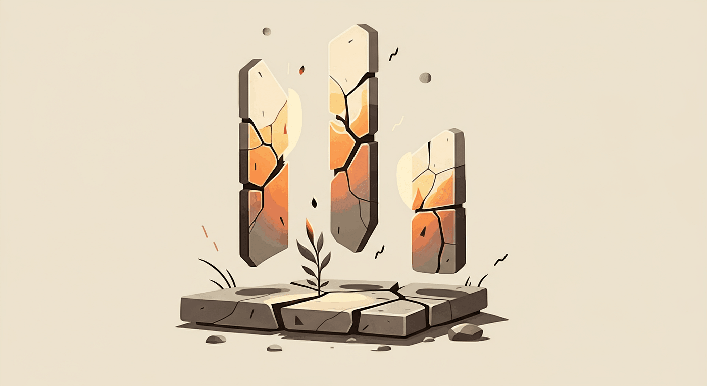
Our challenge wasn’t that the previous work was inadequate, that was far from it. The foundation was strong. But as the team scaled, we needed our design system to be more than just a collection of components. We needed it to be a source of truth that removed ambiguity and made the right choice the easy choice.
That’s where design tokens come in.
So, what did we do?
I led our design system team, to take on a comprehensive token overhaul. We wanted to evolve what we had into something better so here’s what we did:
1. Audited everything
We looked at both our core brands, Retail and Business, and audited how colors, typography, spacing, and other design properties were being used across all our products. We identified patterns, inconsistencies, and opportunities for standardization.
2. Extended beyond colors
While color tokens are often the starting point and most popular, we knew we needed to go further. We tokenized:
- Colors (semantic tokens for both brands)
- Typography (font family, font sizes, font weights, line heights, letter spacing)
- Spacing (consistent spacing scales)
- Border radius
3. Built a multi-brand system
Kuda operates two core brands like I mentioned earlier. Our token system needed to accommodate both while maintaining consistency in structure. Studying how other brands did theirs like Microsoft, Atlassian and co, we created a flexible system where brand-specific values could adapt seamlessly.
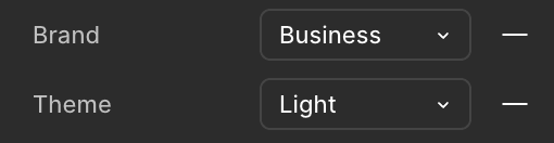
4. Implemented light and dark modes with Figma Variables
This was a game-changer. Previously, we had components with dark mode variants, which meant maintaining two versions of everything. With Figma’s variables and modes, we could define our tokens once and let designers switch between light and dark modes effortlessly.
This meant no more duplicate components, and no more manual updates across variants.
5. Educated the Team
Building the system was only half the battle. We organized sessions where we walked the entire design team through what tokens are, why they matter, and how to use them in their day-to-day work. It’s easier to embrace change when you understand why it matters, not just what changed.
Fast forward three months (The impact)
After implementing these changes, we waited. Would designers actually use the new system? Would it make their work easier or just add another layer of complexity?
Three months in, we gathered feedback from the team. The response was overwhelmingly positive.
“It’s so much easier to pick the colors I need.”
“I love how I can easily switch to dark mode now once I’ve applied the tokens.”
The dark mode functionality, in particular, was a massive win. What used to be a tedious process of managing separate variants and manually changing/guessing colors was now as simple as toggling a mode in Figma. Designers loved it.
But beyond the specific features, something more fundamental had shifted: confidence.
With multiple designers working across different teams and product areas, these tokens have slowly become our shared language. They removed ambiguity and made it easier for everyone to design coherently and stay on the same page. Experienced designers can now move quicker and we’re optimistic new designers can onboard faster. Most importantly, the decision-making process has become more consistent across the board.
But we’re not done yet
As proud as we are of the progress, we’re far from finished. Great design systems are never “done”, they evolve with the team and the product.
Here’s what we’re tackling next:
1. Developer adoption
This is our biggest challenge right now. While designers have embraced the new token system to a good level, getting developers to adopt it is trickier. Without automation, it requires manual work and coordination. We’re exploring ways to bridge this gap, whether through better documentation, plug-ins, or closer collaboration with engineering.
2. Full token adoption across the board
While designers have really embraced the color and typography tokens, spacing and radius tokens are still a work in progress. Old habits are indeed hard to break, and we’re working on making these tokens just as intuitive and easy to use as the color system has become.
3. Documentation
Tokens are only as good as the documentation that supports them. We’re working on creating clear, accessible documentation that explains not just what the tokens are, but when and why to use them.
4. Updating legacy designs
We still have older components and screens that haven’t been updated with the new tokens. This creates design debt — if left unaddressed, designers might pick outdated components and perpetuate the old system. We’re systematically updating these, starting with the most frequently used components and files.
5. Continuous Refinement
As the team uses the system, we’re gathering feedback and identifying areas for improvement. Design systems should serve the team, not the other way around. We’re committed to iterating based on real usage and needs.
Big S/O to the rest of the DS team: Mano, Great and Ameerah.
A few things I learned along the way
If I could sum up the experience into a few key takeaways, here’s what I’d share:
- Build on what exists. You don’t always need to start from scratch. Sometimes the best work is recognizing what’s valuable and evolving it.
- Adoption is the real metric. A design system’s success isn’t measured by how many components you have, but by how confidently your team uses them.
- Remove friction, not just add features. The dark mode toggle wasn’t revolutionary technology or some magic, it was friction removal. Ask yourself: what’s stopping people from using this?
- Design systems are never finished. I’ve learnt to embrace the ongoing nature of this work. Every milestone is just the beginning of the next phase.
- Design tokens are more than variables, they’re a shared language. When done right, they create alignment across design and (eventually) development.