
KDS 2.0: Kuda's design system, rebuilt for a new brand
In 2026 Kuda refreshed its brand, with the identity created by Barkas. I lead the design system team at Kuda, and this case study covers how we rebuilt the system that carried that identity into our products.
- Company
- Kuda
- Role
- Product Designer (Design System Lead)
- Type
- Fintech, Design Systems, Design Strategy, Systems Thinking, Design Engineering
- Impact
- KDS 2.0 launched across Retail and Business brands
- <1 week to reskin most of existing app
- ~80% visual updates handled by design system
- Token pipeline across web, iOS and Android
Why change
Kuda launched as the Bank of the Free. Seven years later, customers were building businesses, raising families and taking on more. The product had evolved. The brand was still speaking to an earlier version of the customer.
When Kuda partnered with Barkas to refresh the identity, it became a chance to change more than how the product looked.
We were already halfway there
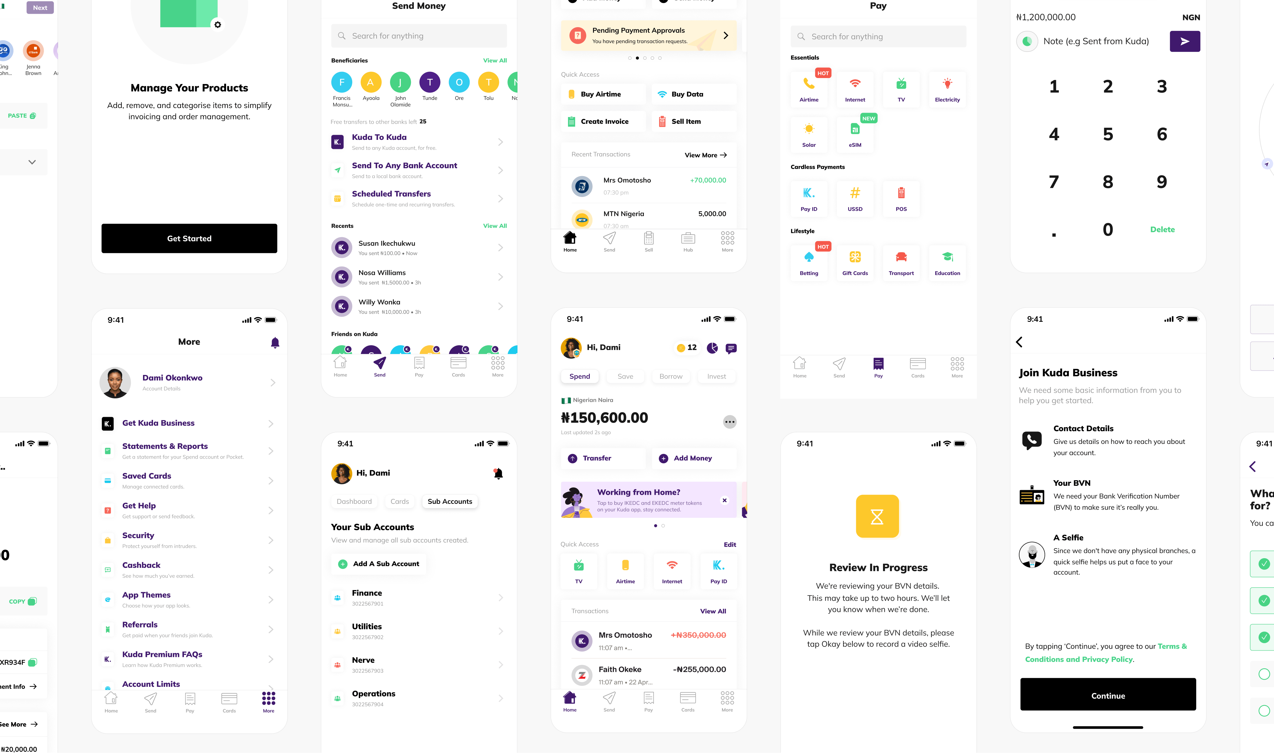
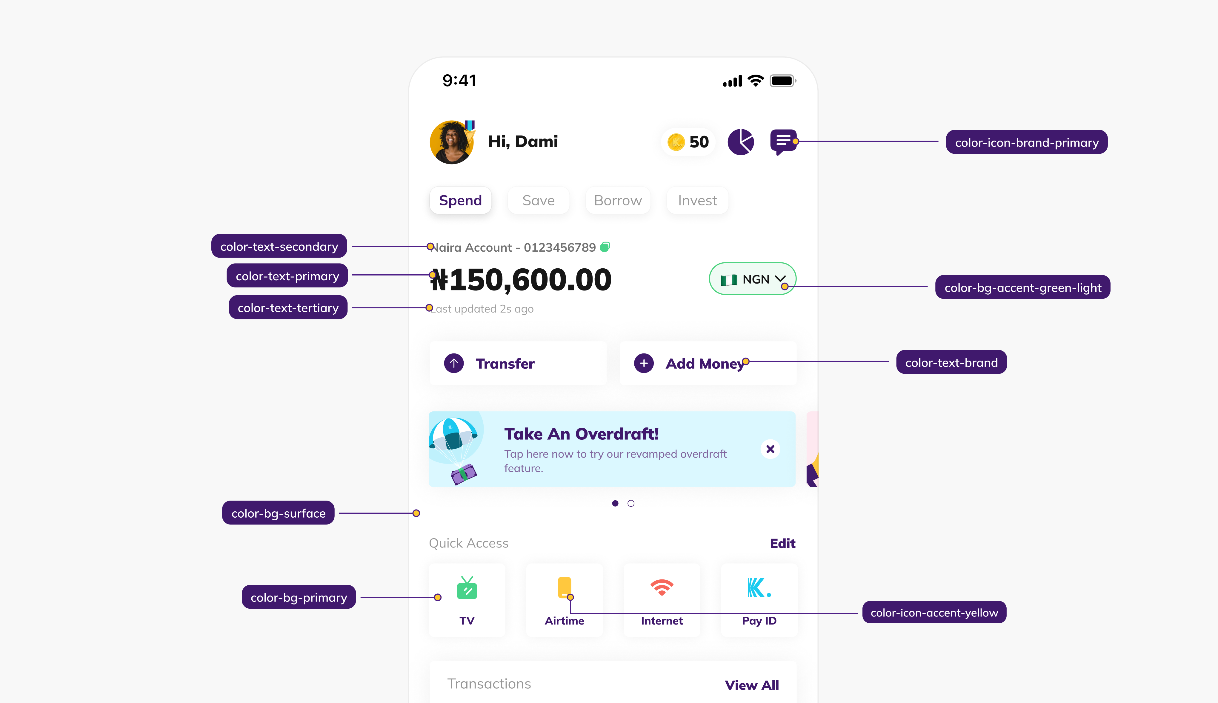
KDS 1.0 was in place when the refresh began. The year before, I had rebuilt the token layer as part of a separate overhaul. Nobody knew a rebrand was coming, but the system already understood semantic colour and theming, so the refresh could focus on changing values rather than changing how the system worked.
The brand refresh
Working with Barkas
Barkas developed the new identity through several rounds of sharing where the product was and where we wanted to take it. What we landed on reflected the company Kuda had grown into.




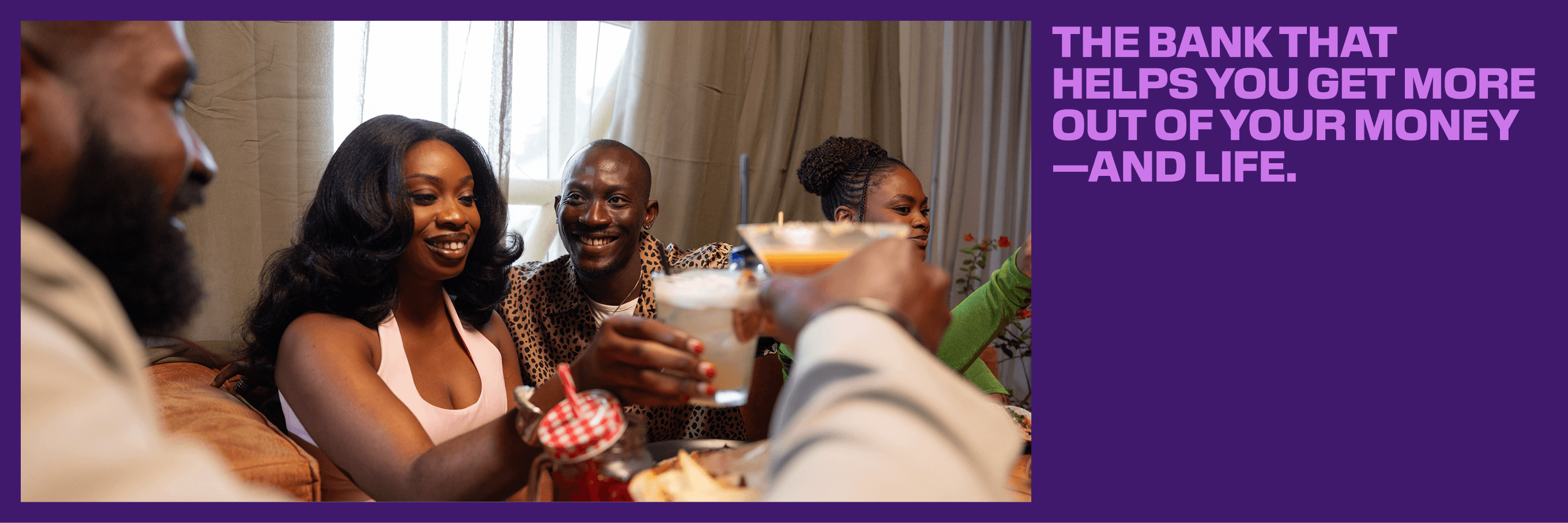
New colours, new type, and less shadows
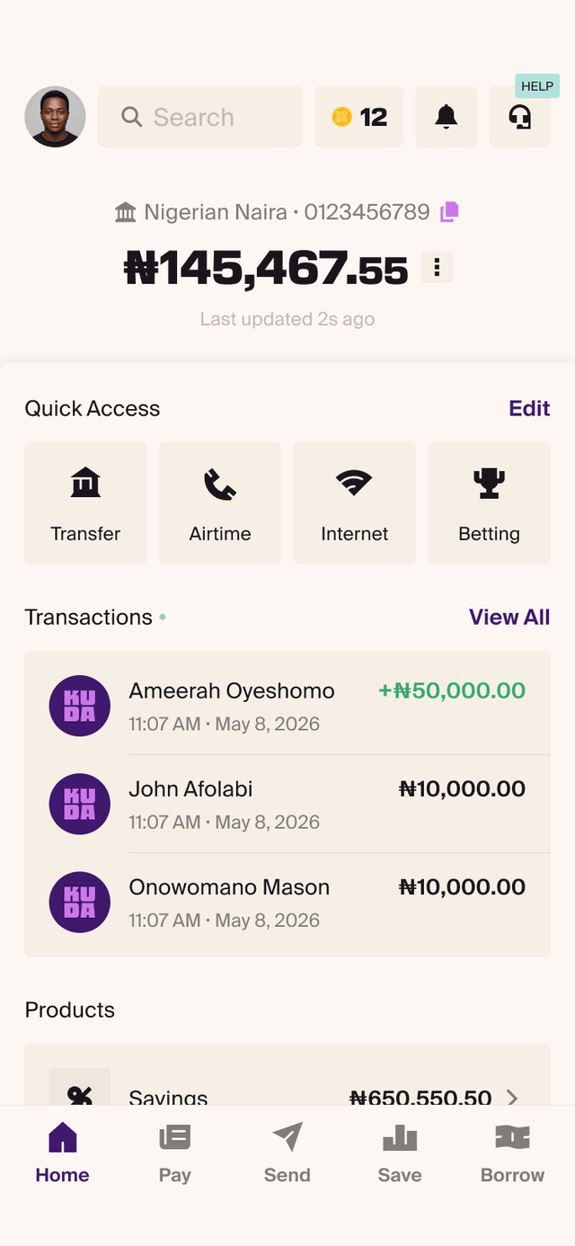
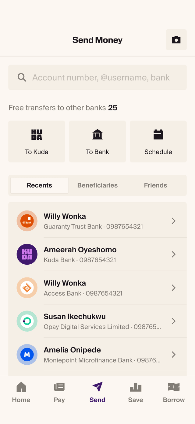
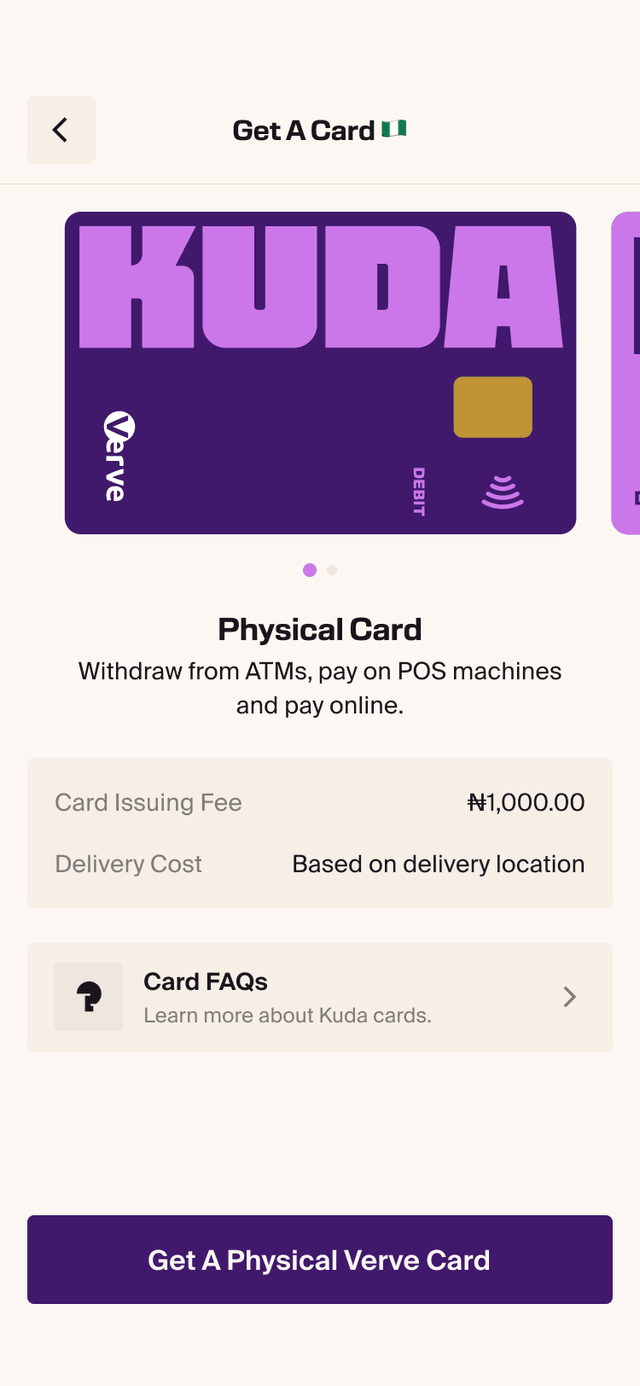
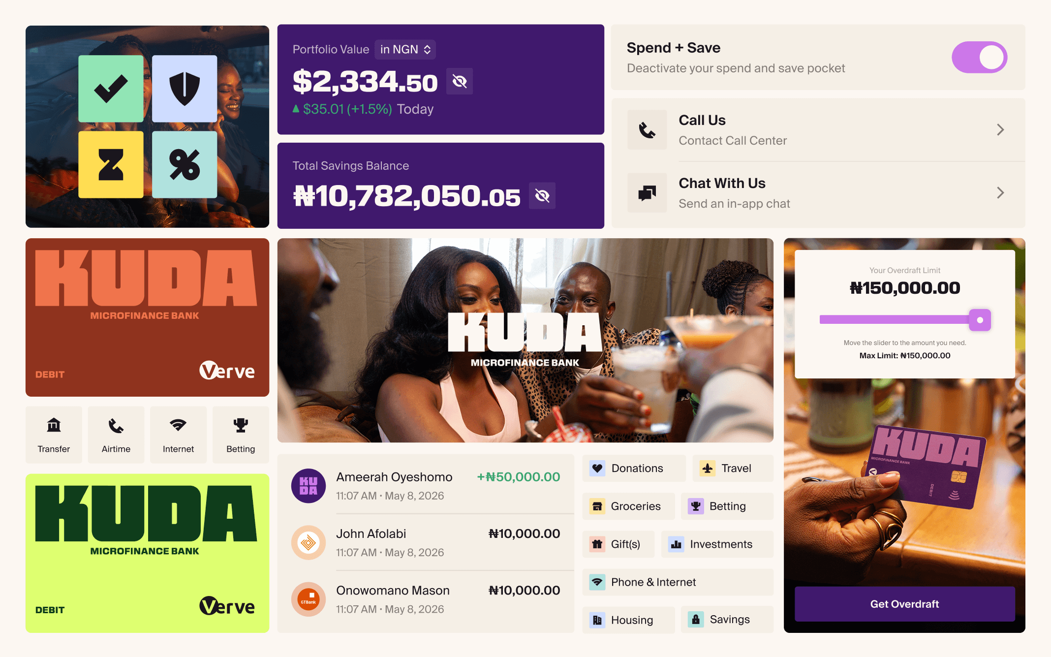
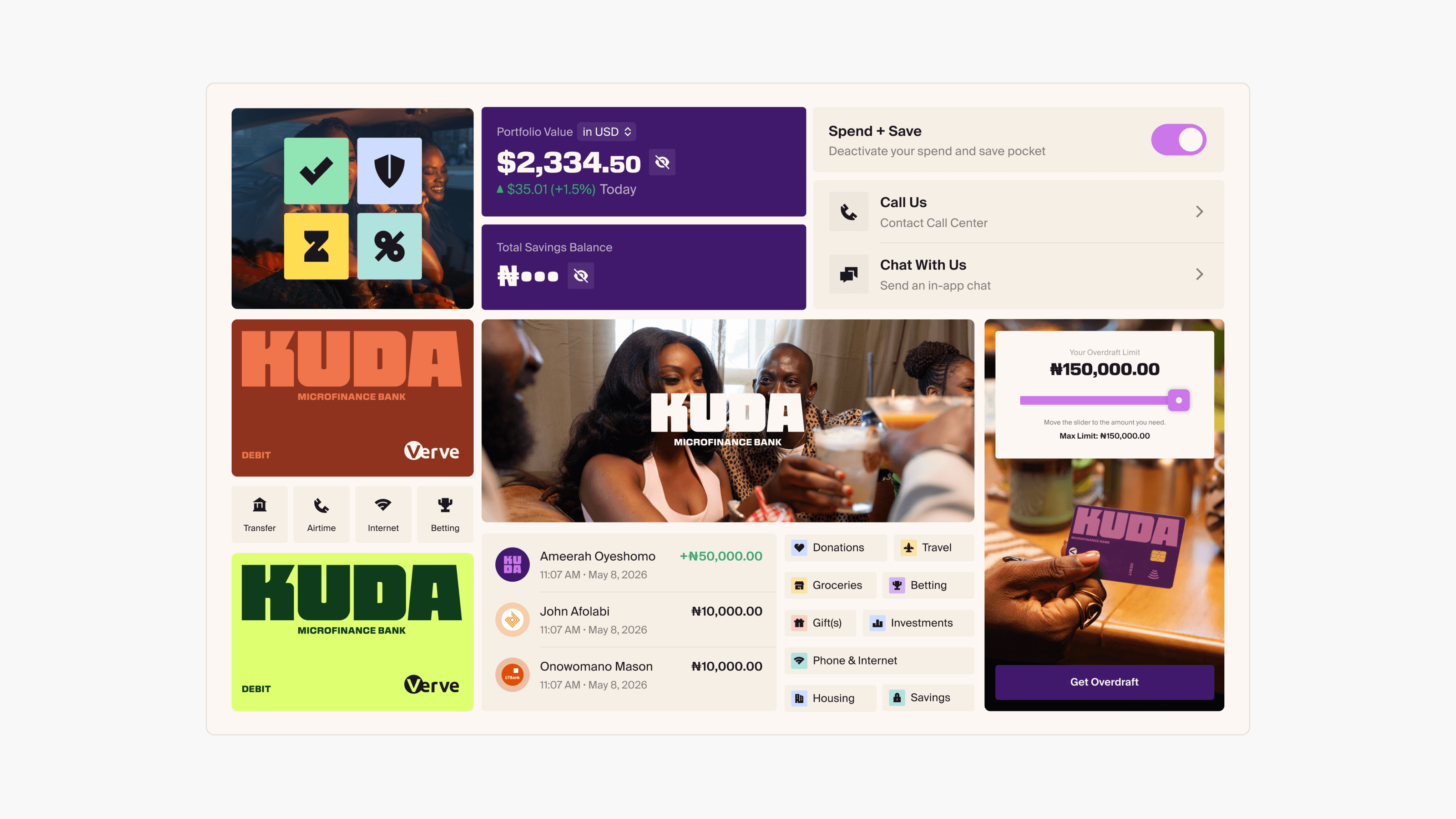
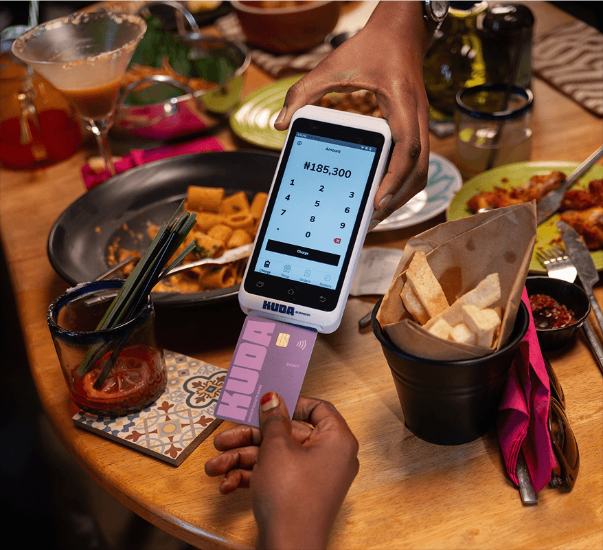
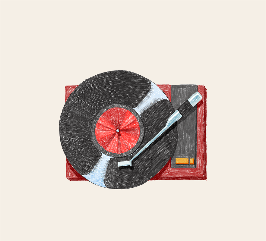
The refresh brought new colours, typography, imagery and visual principles. Some of it was aesthetic. Pulling back on shadows was not. We kept them for the cases that genuinely need depth, like dropdowns and modals, and everywhere else colour and surfaces took over the job of carrying hierarchy and elevation.
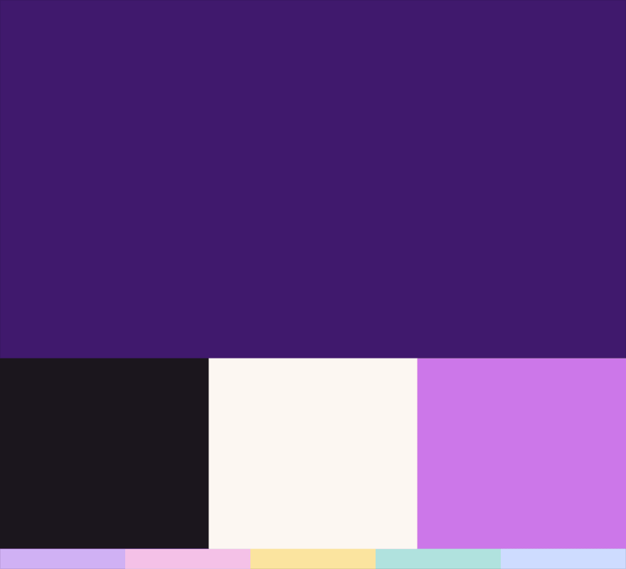 Color
Color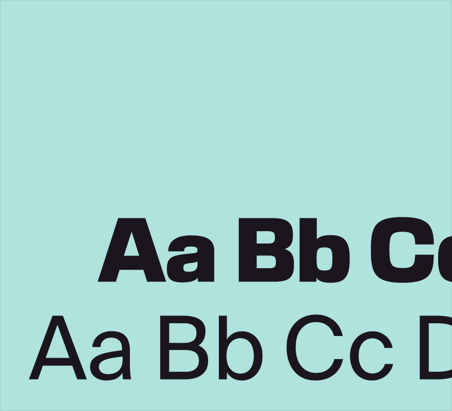 Typography
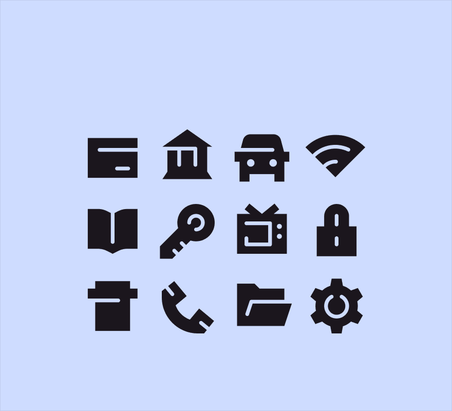 Iconography
 Motion
 Photography
 Illustration
Taking the concepts into product
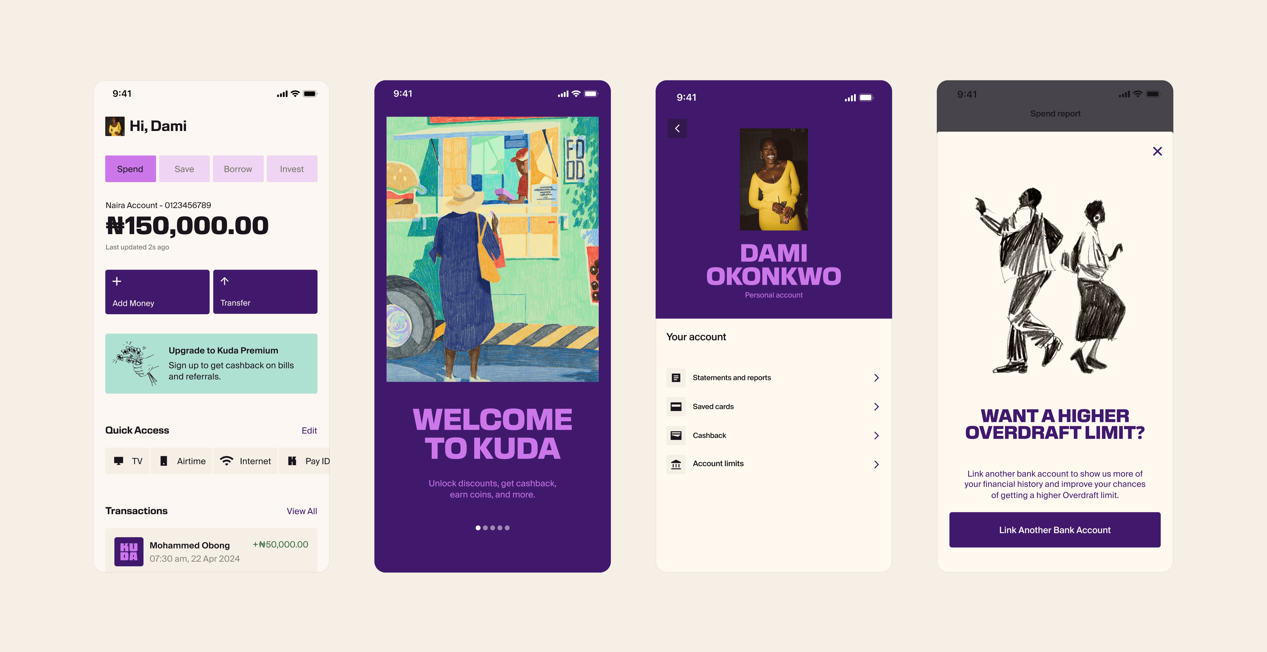
Barkas also explored how the new identity could show up in product, which gave us a useful starting point. Translating those ideas across the rest of the product was ours to work out, and it drew on context they didn't have: how our customers use the app, the realities of our market, and the behaviours and constraints that had already shaped the experience.
Defining the system before building it
Working against a moving target
At the time when the brand was still moving, every round with Barkas could still shift colour, type choice or iconography. Building components against that would have meant rebuilding them each time something landed differently.
I led the architectural work instead: system structure, migration approach, file structure, and new Figma teams with KDS 2.0 libraries on by default so there was no question about where new work belonged.
Rethinking how theming worked
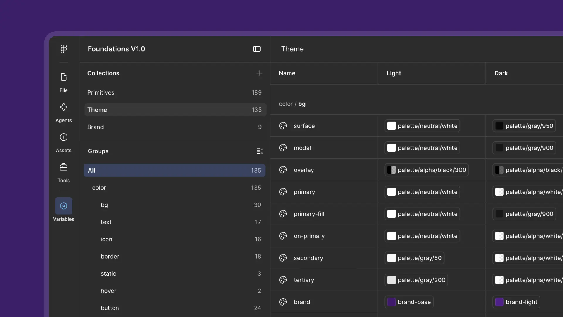
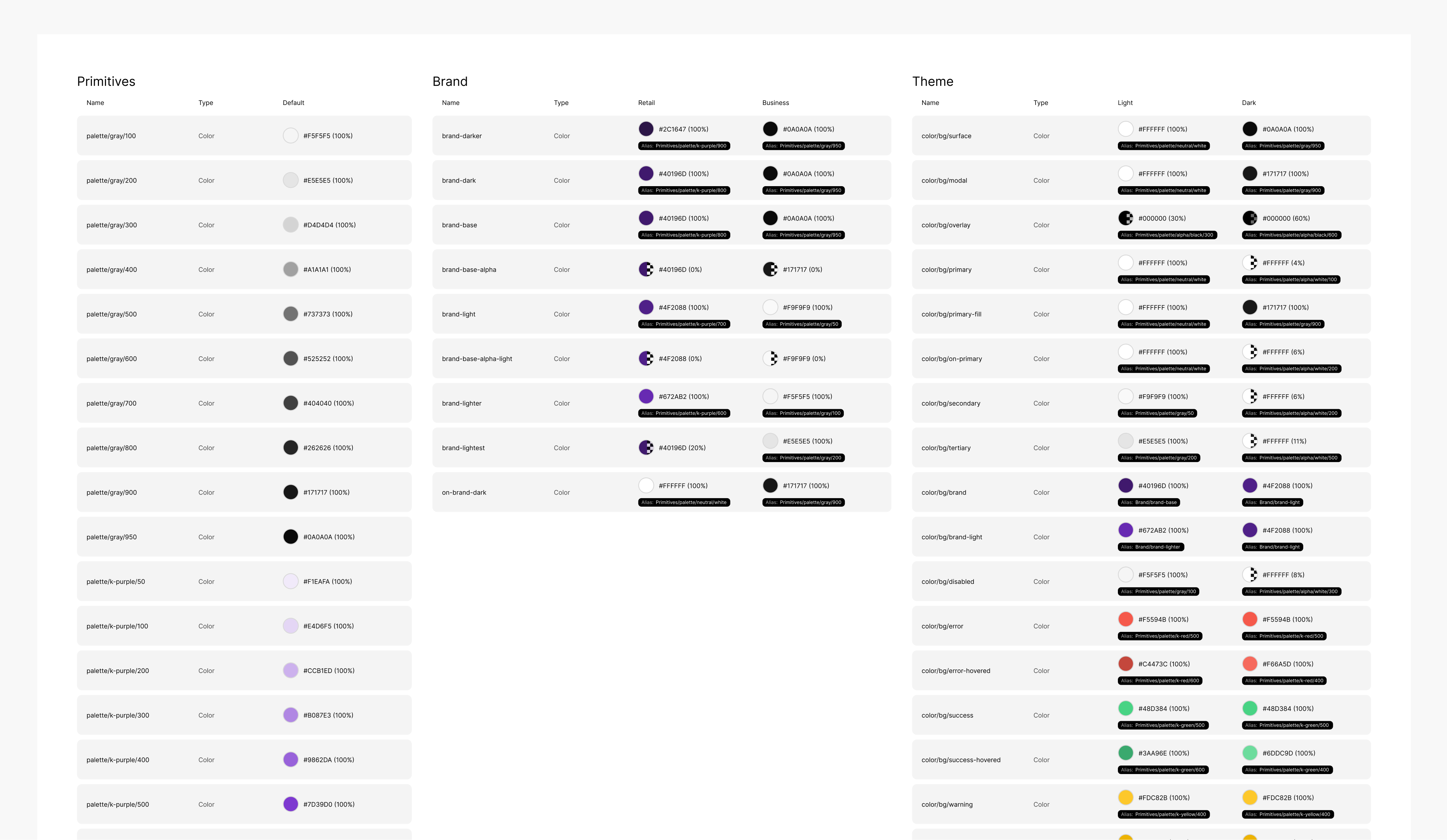
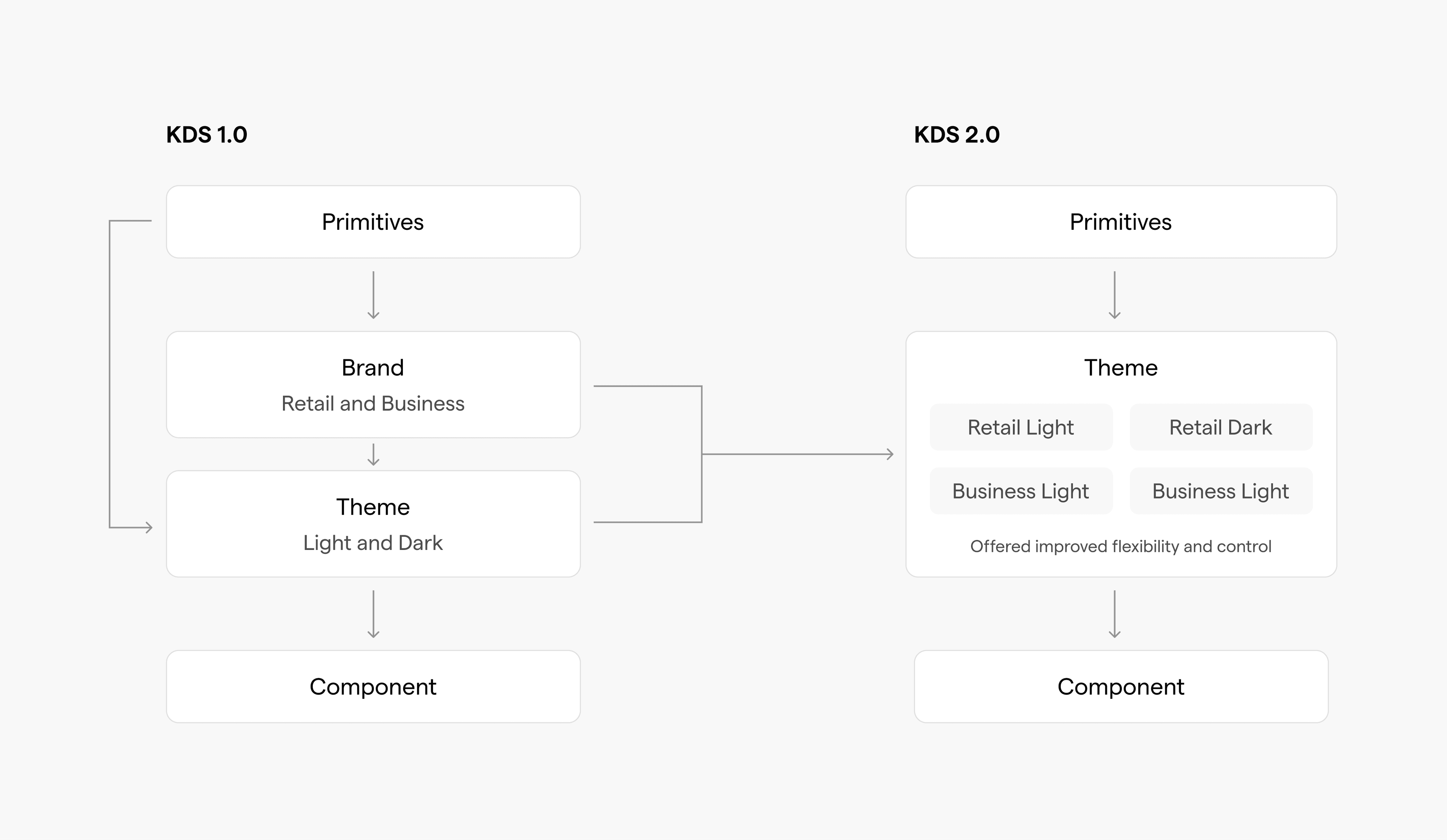
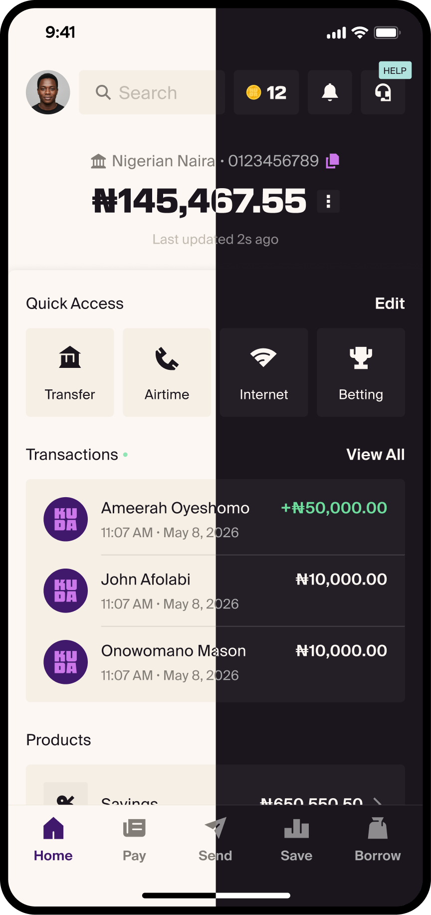
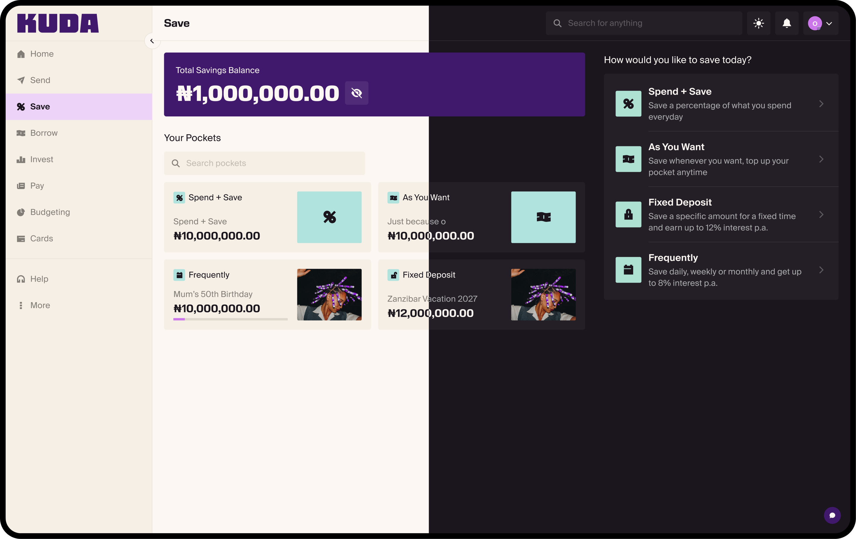
The old setup had a separate brand layer sitting above appearance modes. KDS 2.0 collapsed that into a single theme layer covering Retail Light, Retail Dark, Business Light and Business Dark. Smaller, and a lot more flexible to work with across both brands.
Reskin vs redesign
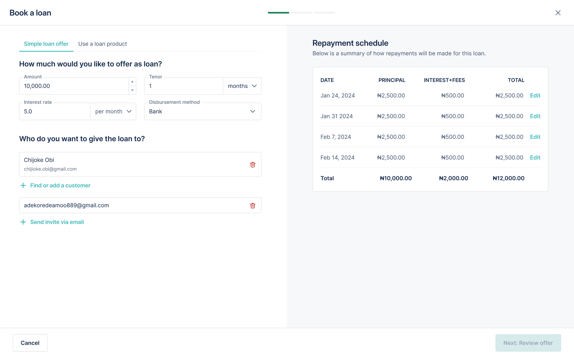
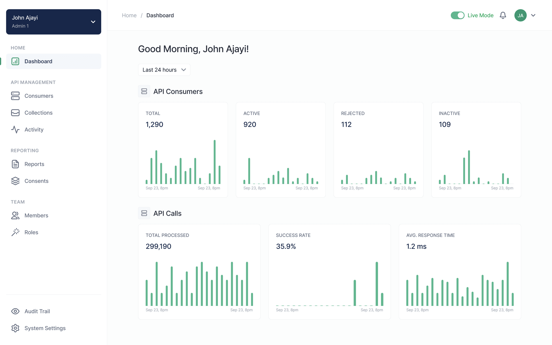
We were well into a broader redesign when conversations with engineering surfaced a problem: the scope of the redesign would not fit the implementation timeline. So, we had to narrow the redesign to core navigation and top-level experiences while inner screens/flows would keep their KDS 1.0 patterns and get a visual reskin instead with Web being the exception. They had the resources to take on the full redesign, so they did.
By then most of the timeline had gone into the redesign. Treating the reskin as another screen-by-screen project would have created a body of work we did not have time for. So the question stopped being what needed to change visually, and became how much of that change the system could absorb.
Using the old system as a bridge
KDS 2.0 existed on its own, but the product was still built on the old system. Moving every reskinned screen onto KDS 2.0 individually would have defeated the point, so I duplicated the old foundations and mapped the refreshed brand values into them. We had originally designed most of the new components off the old ones without changing too much structure-wise and the architectures were close enough that finding equivalent tokens was straightforward.
Then I updated the existing component library against those foundations: new colours and typography, fewer shadows, surface colour carrying hierarchy instead.
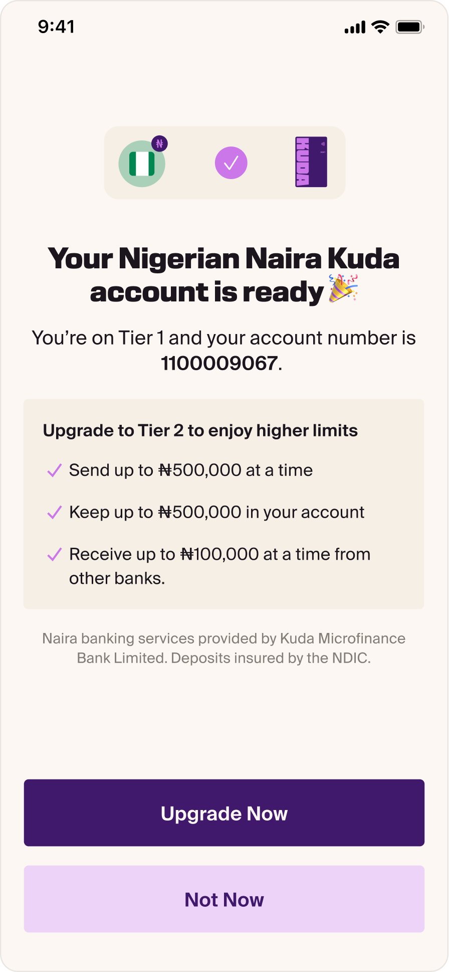
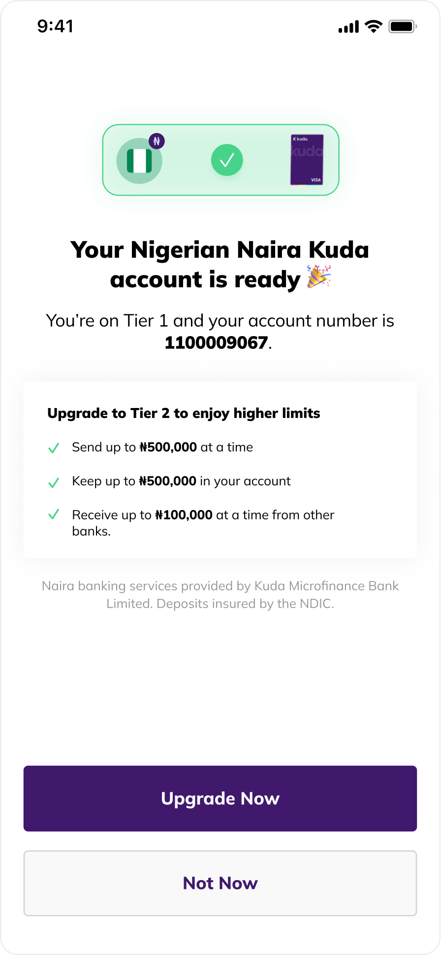
Propagated automatically
To get the bulk of it done
Some screens had hardcoded values or exceptions that needed attention, but what could have been a second full reskin timeline became a review and correction exercise. I ran that pass across the team, tracking every surface in the app so progress stayed visible while it closed out.
Driving adoption beyond Figma
The year before the refresh I had built a working web demonstration of the token pipeline. That was enough for the web team to begin implementing in January, ahead of the redesign, which is why they were able to take on more scope than anyone else and still finish first.
iOS was less convinced. The pushback was whether the pipeline would work there at all, given how the codebase was architected at the time and the third-party dependency it would introduce. A document was never going to answer that. So I built a separate iOS demo showing the pipeline working end to end and seeing it run settled the question. They connected the pipeline themselves and reused the components I had built in the demo, which took some time off their implementation.
One source, three platforms
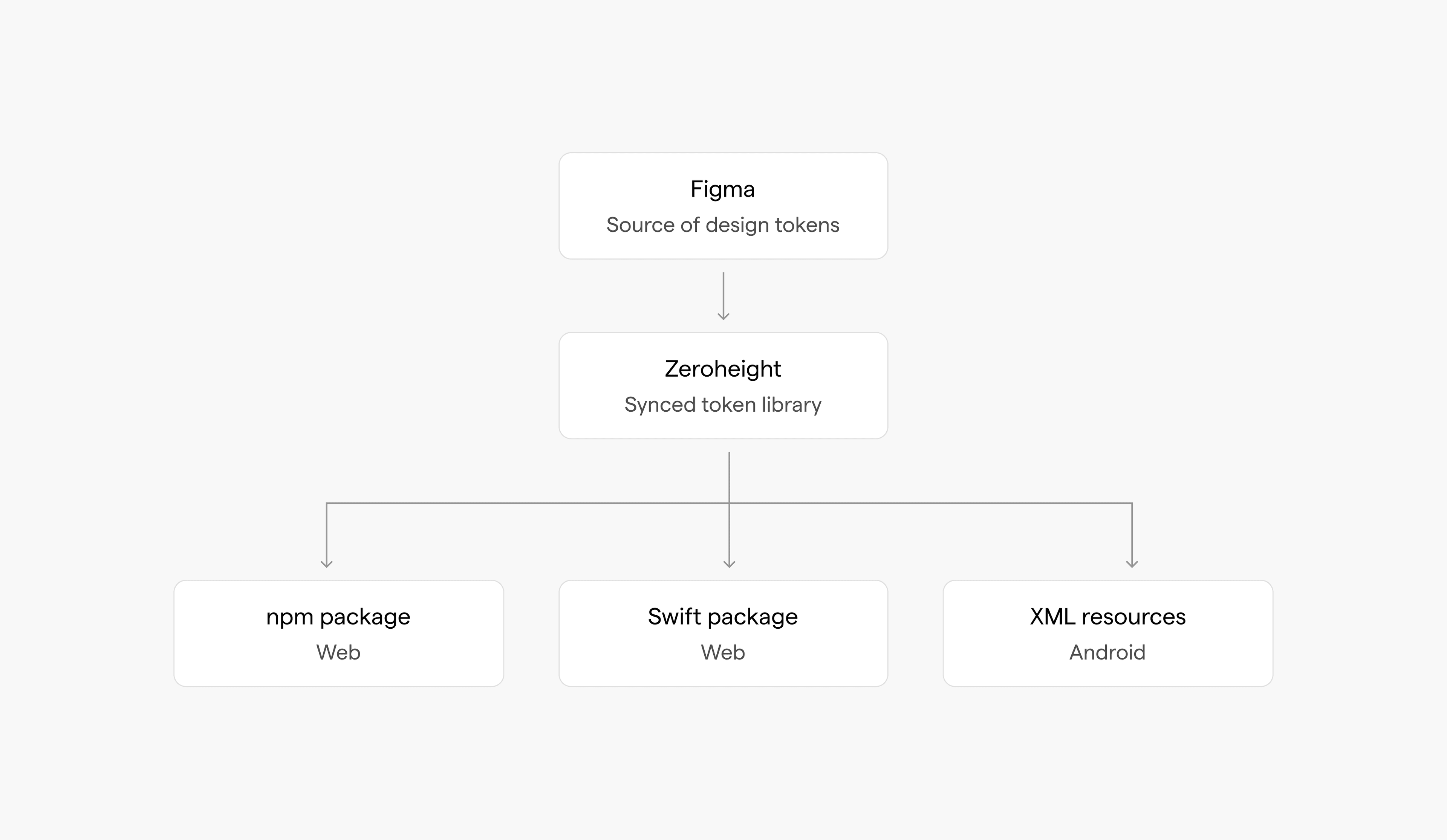
Tokens sync from Figma to Zeroheight, and web, iOS and Android each pull that same raw export and generate their own platform-specific output with Style Dictionary. Teams worked from the same underlying decisions instead of three systems that drifted apart.
Dark mode everywhere else
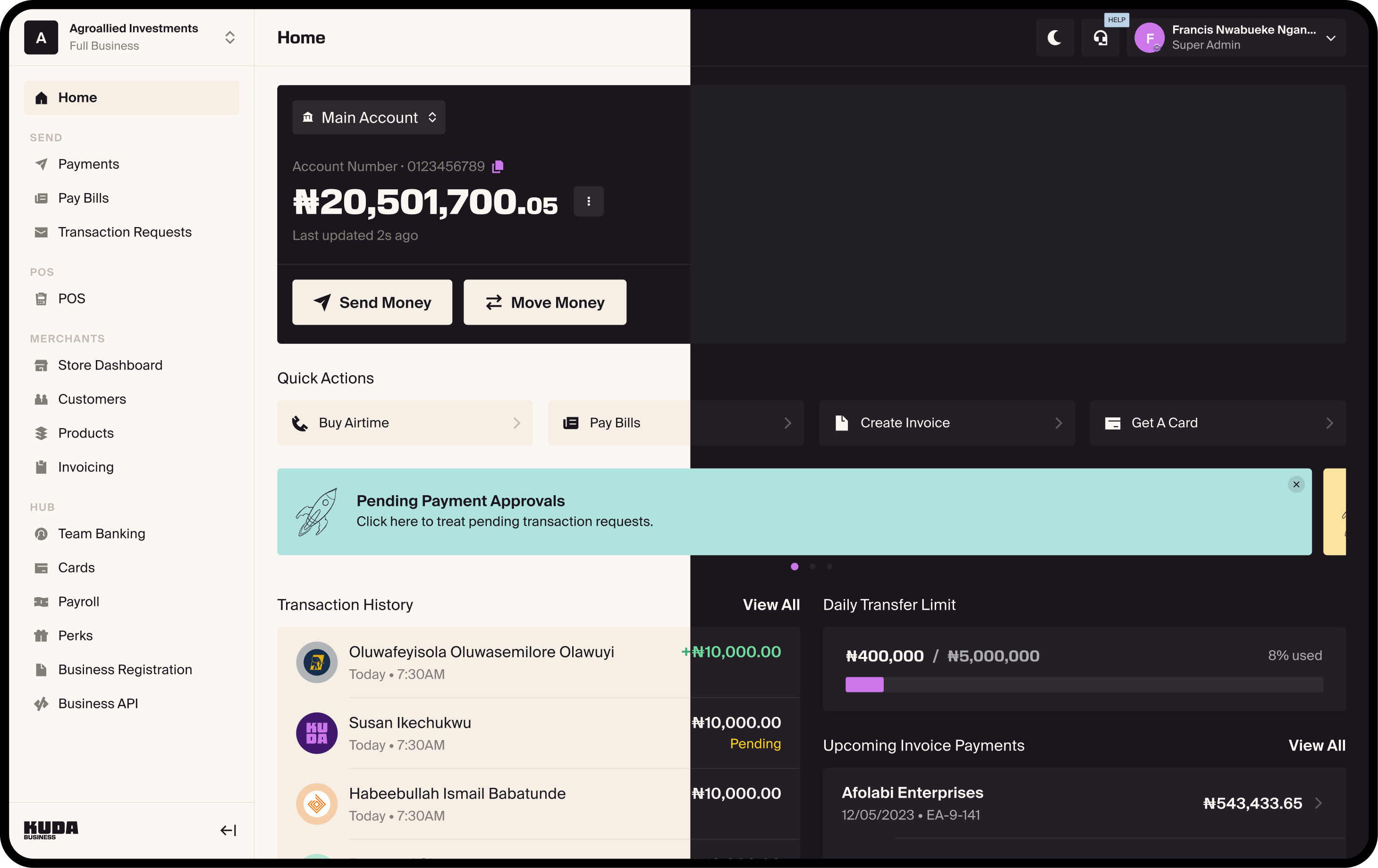
Before the rebrand, only the Retail mobile app had dark mode. Business mobile didn't, and neither did web on either brand. Once the theme structure and pipeline were in place, all of them got it through the system rather than as three separate projects.
Getting everyone onto it
KDS 2.0 wasn't released after the refresh, it was released during it. As soon as foundations and priority components were ready, teams could start using them, so system work and product work moved in parallel instead of waiting on a handoff.
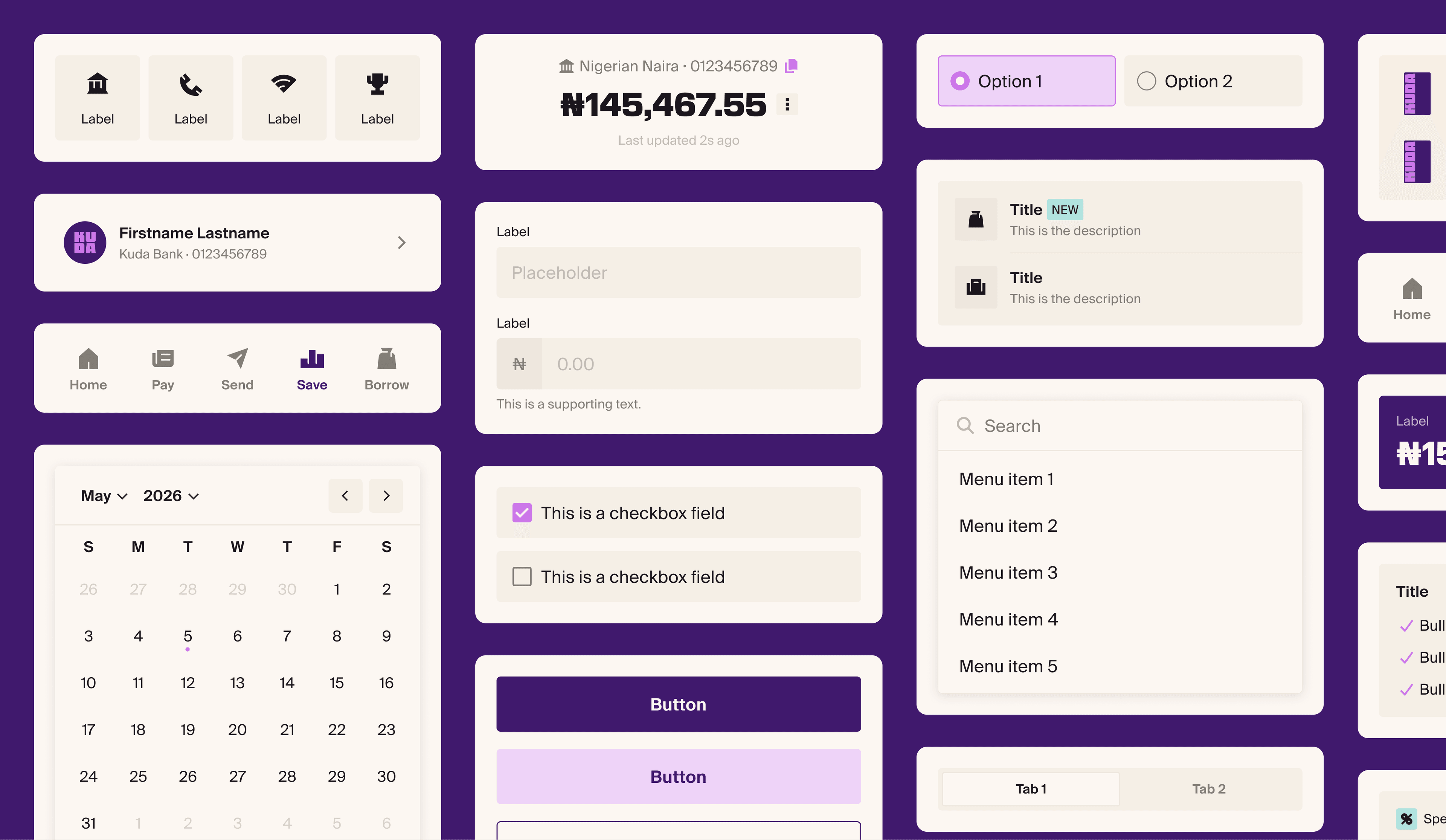
Weekly reviews, migration guidance, dedicated channels and a champion network inside engineering carried teams across while the system was still changing underneath them. Documentation is still catching up, but the system was super useful long before it was finished.
The Outcome
Time to complete the bulk of the visual reskin, across every surface in the Retail mobile app.
Of the reskin propagated automatically once the updated libraries were accepted.
Token adoption, now including engineering, up from a design-only starting point before the refresh.
Retail and Business, light and dark, on web, iOS and Android, from a single token source.
Credits
- Designers: Oluwapelumi Abimbola, Onowomano Iluezi-Ogbaudu, Ameerah Bibire
- iOS Engineers: Oluwatomisin Oyegoke, Mariam Abdulkareem, Fuad Gbadamosi, Nasiru Danjuma, James Nwankwo
- Android Engineers: Oluwatayo Adegboye, Olaitan Gbindinninuola, Chukwudi Egbuna, Simon Ojok
- Web Engineers: Dayo Abegunde, Chidera Ugochukwu, Yvonne Irenroa, Victoria Banjo, Emmaculate Kuyele